Product Explainer Video: Drive-Thru Insights
Goal
As a core selling piece for this B2B SaaS product, an explainer was needed to help customers understand the benefit of the product. This will be used for the product webpage and LinkedIn ads to drive lead generation, in addition to building excitement at trade shows in the looping booth video. The timeline was 5 weeks to complete the video so it would be ready for the product launch at a trade show.
Role
Project manager, designer, illustrator, animator.
I built an aggressive schedule with consistent communication to stakeholders to keep all phases on track to meet the deadline. To ensure success, I enrolled in School of Motion to take classes on explainer videos and animation principles.
Check out the case study below
Step 1: Research
To make the most effective explainer video, I read through the Product Positioning Guide to understand the positioning statement, customer pain points, features, and benefits.
The Product Marketing Manager filled out an outline to clarify the problem, the solution we offer, and high level details of how we solve the problem. We talked through this outline in detail to clarify points and ensure we’re focusing on the right features.
I took the outline and drafted a script that would work well for this explainer video. The team had several round of revisions to the script until it was finalized.
Step 2: Concepts
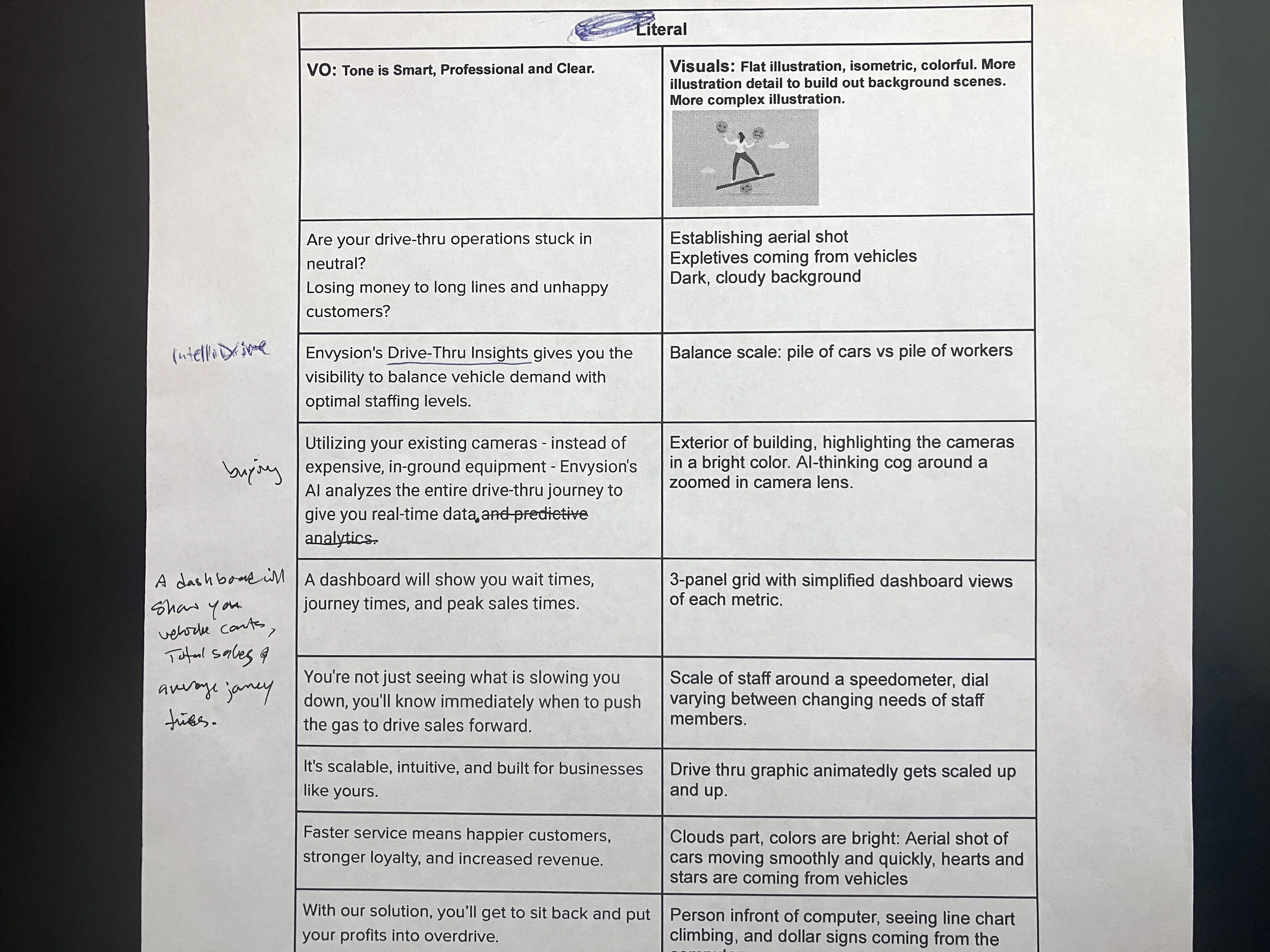
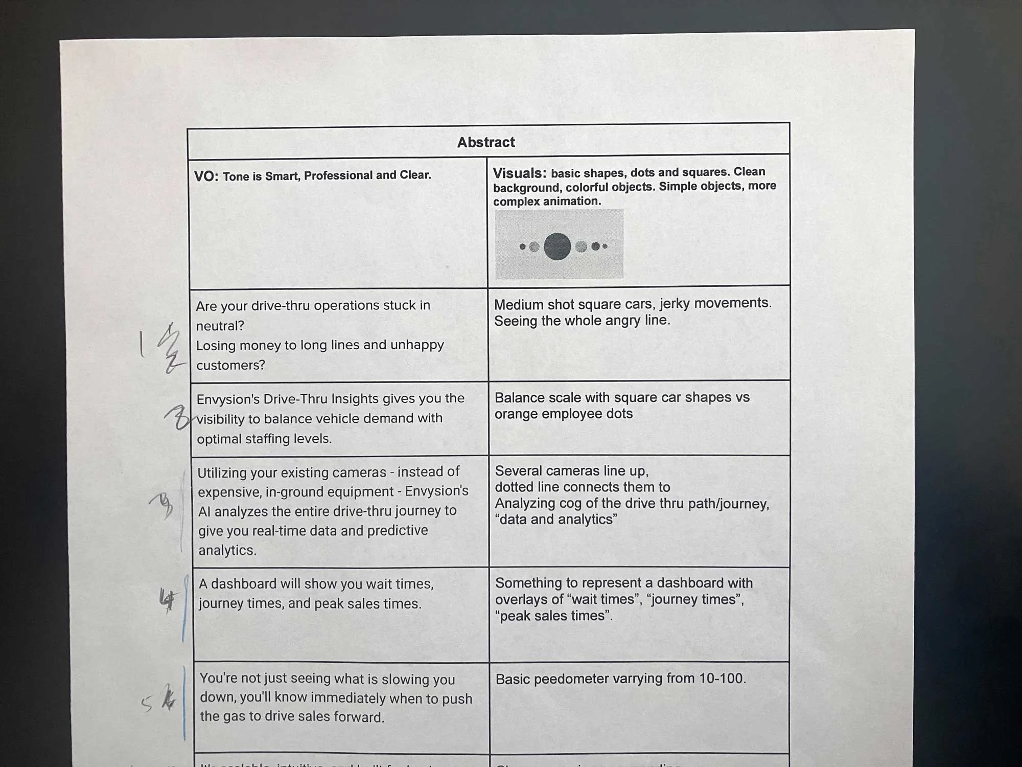
Taking the script, I bracketed three concepts for the visual script. An abstract concept, a literal concept, and one in the middle that blended the two.
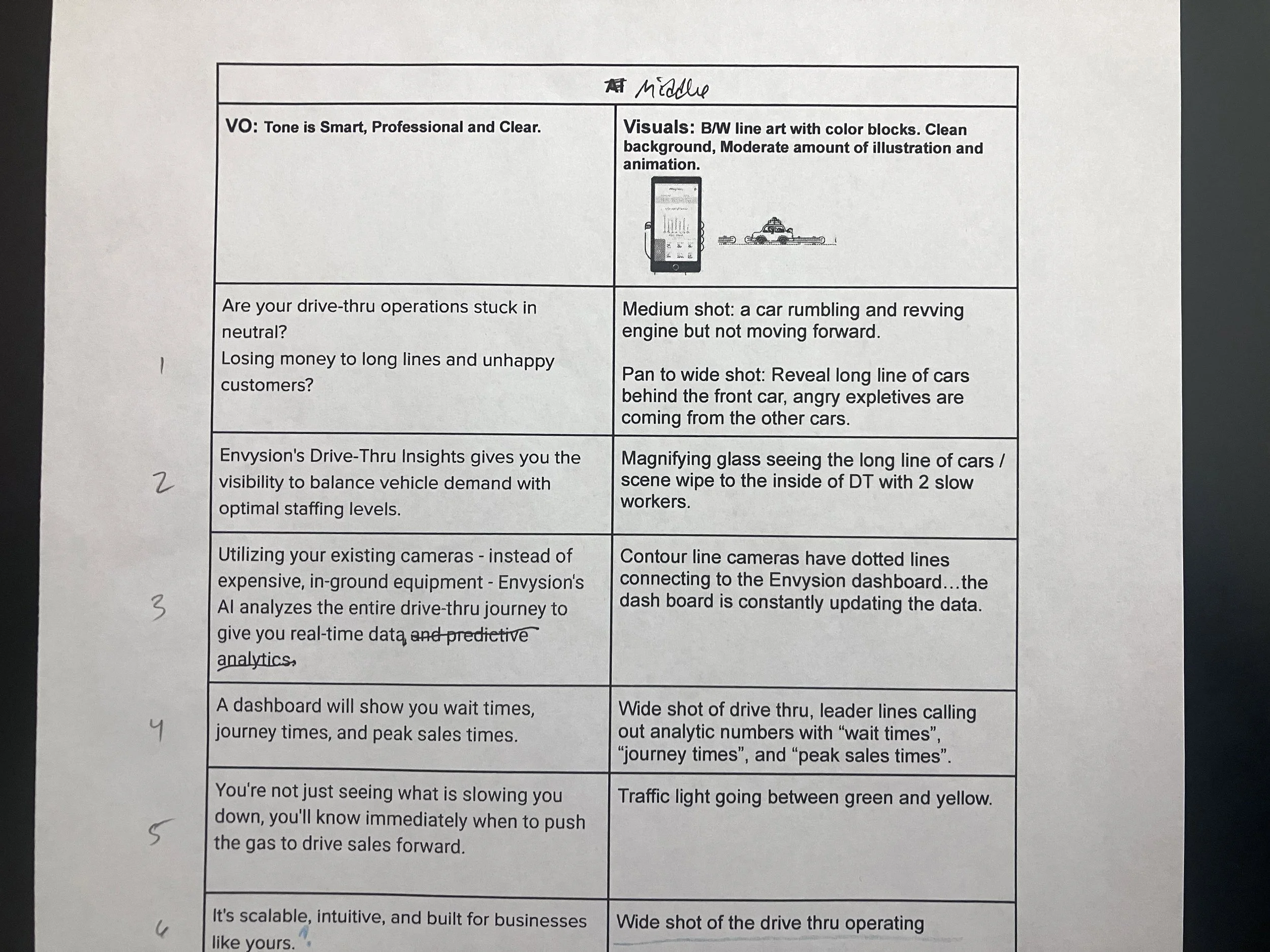
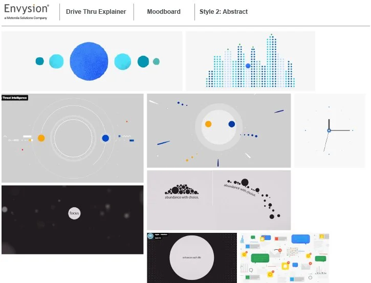
From those three visual scripts, I narrowed the concepts down to two options to build storyboards for. I made moodboards for visual inspiration.
A treatment, moodboard, and storyboard sketches were presented to the team so they could select a direction.
Thinking ahead, the abstract option would save time on creating detailed graphics, but the animation time would be more intensive. On the other hand, the literal option would have much more time spent creating the graphics and use a little less time in animation.
The team unanimously chose the literal option, but having worked through the abstract ideas I was able to pull some visual metaphors to break up the seriousness of the product.


Step 3: Design
The next phase was to create style boards, actual graphics that would be used in the final animation. The first round used stock vector art, but the inconsistency between different assets made the project feel disjointed.
I used a flat graphic style to simplify the concept and make the animation process streamlined to keep the project on schedule.

Step 3: Design Cont.
Now that the team was seeing some real visuals they comprehended the project better and made changes to the aerial drive through layout and a closing scene that was realistic. Restaurant owners don’t have time to sit at their desk, they’re constantly on the move visiting their stores, so having an owner outside of a restaurant with only time to lean against a wall is closer to reality.
I made original illustrations for the second version of style boards, keeping a more consistent style throughout the piece. Colors played a large role. In the beginning we have a dark grey background that sets the mood, with plain white cars that are disgruntled. The teeter totter scene uses an off-yellow, depicting that things aren’t quite right. But once the solution is introduced we have a calming blue to signify that things are under control. Finishing with happy colorful cars enforces the positivity of having the solution.


Step 3: Execution
The animations for the first two scenes were meant to be playful and inviting. I even animated the wheels rolling with the car movement to help sell it.
The aerial drive-thru scene shows how the product works, so this needed to be very literal. The counters on the vehicles were a little tricky. I set a tolerance of 30 seconds before the vehicles’ colors change, signifying a backup, so to showcase the most action I ramped up the timers and applied some math to keep them all counting at the same rate.
I originally recorded a “scratch” voice over to get the animation going. Once the team approved the draft animation and committed to the script, I hired a professional voice over artist. I cut in the professional VO and paired it together with music, and added the sound design. The original goal was for a 40 second animation, but there were additions from the team along the way, to cover the product with enough detail it was extended to 1:00 of animation to tell the full story.
That’s a wrap!
There were changes from stakeholders along the way, but it all happened before the time-consuming animation phase. This was a big project, but with a clear schedule that outlined the steps, and ensuring team buy-in throughout the process, there weren’t any setbacks and it was completed on time, and best of all…the team loves it!
My process for this project was methodical and kept it streamlined. I earned School of Motion’s “Student of the Week” for my styleboards. Focusing on clear communication with visual metaphors helped my work get recognized.